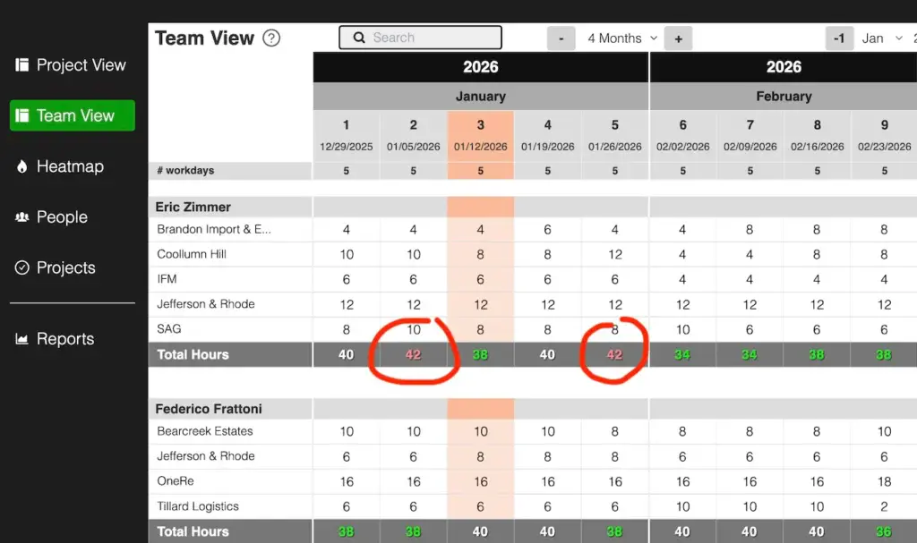
The Team View gives you a clear overview of each person’s workload across all projects.
It’s part of how Caperity visualizes workload and capacity — complementing the Project View, which looks from the project side.
It’s designed for managers to see:
- How each team member’s time is distributed across projects
- Individual workload
- When people are on leave or unavailable
Key Features
- People-first layout: Each team member appears as a main item, with their assigned projects listed underneath.
- Calendar grid: Displays planned hours per day or week (depending on the selected calendar mode).
- Workload visualization: See each person’s workload at a glance. Color coding helps you spot overbooked or underutilized team members based on their available capacity.
- Totals per person: Quickly see the total planned hours per week or per day for each team member.
- Color-coded cells: Highlighted cells indicate absences or holidays (pulled from leave tracking)
Not seeing anything in Team View?
That’s because the Team View only displays content once projects are created and people are assigned to them.
To get started:
- Create your projects: Go to the Projects page and add projects.
- Add your team members: Make sure all people who will work on projects are listed on the People page. You can add them manually or import them if you’re setting up multiple at once.
- Assign people to projects: Open each project and assign team members.
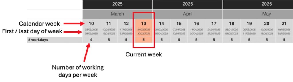
Understanding the Calendar Header
The calendar header gives you quick context for the time period you’re viewing in the Team View.
Weekly format: Each column represents one ISO week. The header shows:
- The week number (e.g., Week 42)
- The date range for that week (e.g., Oct 13 – Oct 19)
- The number of working days in that week, based on your or holiday setup
Daily format: Each column represents a single day, labeled with the weekday name and date (e.g., Mon 14 Oct).
Navigating the Team View
The navigation bar at the top helps you move around quickly and adjust what’s displayed on screen.
- Search field: Use the search box on the left to quickly find a specific project or team member. Results update as you type.
- Visible months: Choose how many months you want to display at once. You can adjust this depending on your screen size. If the first column disappears, reduce your browser zoom.
Date selector: Use the dropdowns to jump directly to a specific month and year. The + / − buttons move the view one month forward or backward. - Monthly totals: Toggle between Show monthly total and Don’t show monthly total. When totals are shown, each project displays a monthly summary broken down by team member — useful for a quick overview of total planned hours.
- Legend: A color guide on the right helps you interpret what the colors in the calendar cells mean (e.g., planned hours, absences, holidays).
Making Everything Fit on Screen
Depending on how many months you display, the first column (projects and team member names) may shift out of view on smaller screens.
If that happens:
- Reduce your browser zoom level until the first column becomes visible again.
- You can also decrease the number of months shown to create more space for names and details.
The zoom function is available in your browser’s menu (usually under View → Zoom) or can be adjusted using keyboard shortcuts like Ctrl + / − (Windows) or ⌘ + / − (Mac).
Tip: A zoom level of around 80-90% usually provides a good balance on most laptop screens.