Use the workload heatmap to see how your team is booked over the coming weeks.
It shows where bottlenecks are likely to occur and where capacity is still available.
The workload heatmap is visible to all users in Caperity.
Setting up workload visibility
Workload is tracked automatically in Caperity – no setup required. Add projects and plan work, and the workload view updates in real time.
Follow these steps:
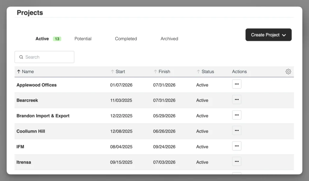
1. Add projects
Create all current and upcoming projects.
2. Add people
Add team members and define their weekly working hours.
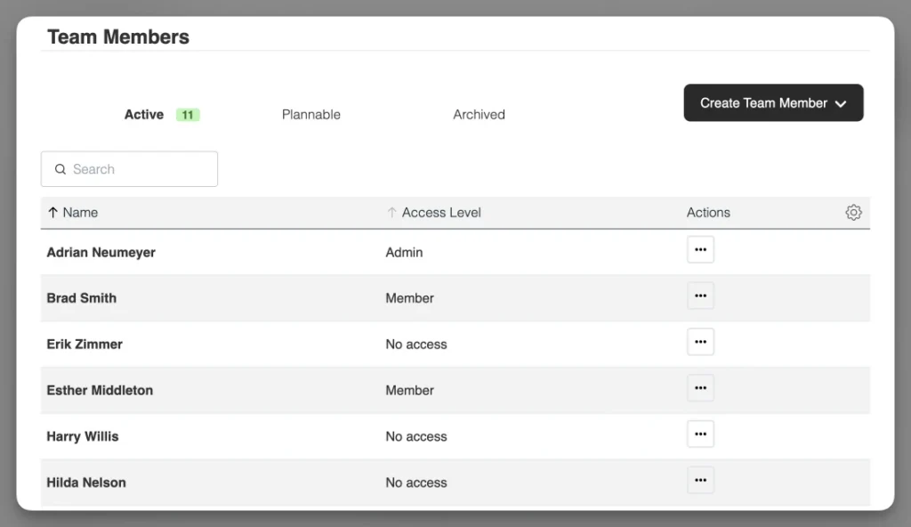
Assign each team member to the relevant projects.
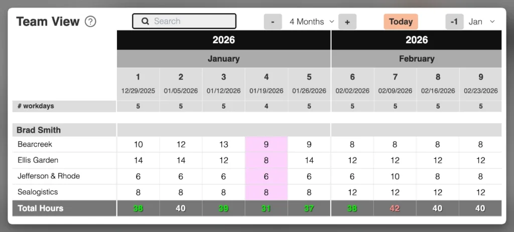
3. Plan work
Enter planned hours per project and team member—per week or per day, depending on your setup.
3. Open the workload heatmap
Caperity compares scheduled work with each person’s capacity. The result is displayed in the workload heatmap. Any updates are reflected in real time.
The workload heatmap
Once work is scheduled, the heatmap displays workload levels using color coding.
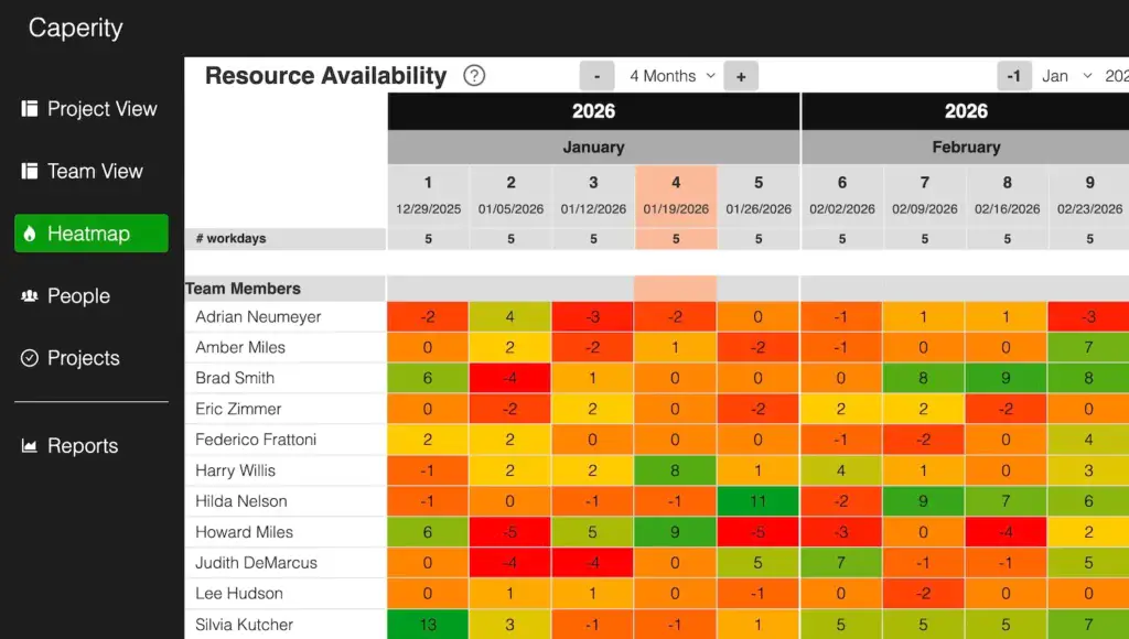
Workload heatmap colors
| Color | Meaning |
|---|---|
| Red | Fully allocated (100%) |
| Amber | At or near full capacity |
| Yellow | Limited availability |
| Green | Available |
Available hours
The workload heatmap also shows available hours in each cell, indicating how much capacity a person has left in that period.
The value is calculated as:
Available hours = Capacity − Assigned work
- Positive values: remaining capacity
- Zero: fully allocated
- Negative values: overloaded
This helps you see how much additional work can be assigned.
FAQ
How easy is it to set up?
It’s very easy. Once you’ve signed up for Caperity, just add projects and team members and schedule work. Most teams are ready in a few minutes.
Does the workload heatmap factor in time off?
Yes. Time off and holidays are factored into each person’s available capacity. If someone has reduced availability in a given period, this is reflected in the heatmap.
How does the workload heatmap handle part-time schedules?
Part-time schedules reduce a person’s available capacity.
The heatmap calculates workload based on that reduced capacity, so fewer hours are available per period. As a result, part-time team members may reach full capacity or overload with fewer assigned hours.
What do the cell values represent?
The numbers shown in the heatmap cells represent the available or remaining hours by person for a particular week (or day). Caperity determines available capacity by taking people’s working hours and subtracting all scheduled work.