Using the Resource Availability Heatmap

The Resource Availability Heatmap in Caperity shows your team’s capacity and workload over time using color.

Each cell represents one person in a specific week (or day) and shows their remaining hours after scheduled project hours are subtracted. The color visualizes how booked they are, so you can easily spot overload, unused capacity and upcoming bottlenecks.

The heatmap helps you answer:

  • Who is overloaded — and who still has availability?
  • How is workload distributed across the team?
  • Where are bottlenecks likely to appear in the coming weeks?
Image of a resource availability heatmap, which shows future resource availability.
The availability heatmap helps you avoid overload and spot unused capacity.

Key features

  • Color-coded availability: Each cell represents a week (or day) and is shaded based on how much of a person’s capacity is utilized.
  • People-first layout: Each team member appears as a row, showing their availability over time.
  • Available hours: Displays a person’s free or unassigned capacity, calculated from their schedule and existing bookings.

How the Availablility Heatmap works

The heatmap visualizes workload and shows available hours per team member and time period. It uses the following input:

  • Scheduled hours (planned work): The hours you schedule for that person on projects in Caperity.
  • Working hours (capacity): Each person has a weekly capacity based on their working schedule (e.g., 40h full-time, 20h part-time).
  • Non-working time: Holidays and time off reduce the person’s available hours in the affected weeks. Both, holidays and time off can be entered in Caperity.

The color scale

The color intensity in the Heatmap reflects how much of a person’s total capacity is used in a given period.

  • Green: Person has available capacity
  • Yellow/Orange: Workload is nearing full capacity
  • Red: Person is overbooked

The color scale adapts to each person’s capacity

The heatmap compares planned hours against each person’s working schedule and uses that as the reference for the color scale. Because you can plan more hours than someone’s capacity, the scale also covers over-allocation (negative available hours).

Example: Tom works 20 h/week and Sarah works 40 h/week. If both are planned with 20 hours in the same week, Tom is fully booked (0 available hours), so his cell will show a “fully utilized / warning” color. Sarah still has 20 hours available, so her cell will show green indicating free capacity.

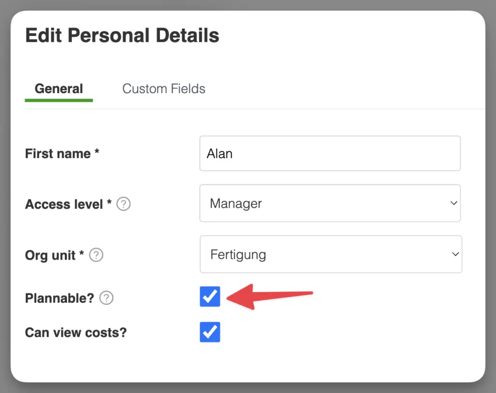
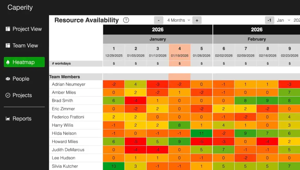
Display of available hours

Knowing the available (or remaining) hours per person (by week or day) helps you forecast workload and spot bottlenecks early.

In Caperity, available hours are calculated as a person’s weekly/daily capacity (from their working schedule) minus the total planned hours assigned to them for the same week/day across all projects:

Available hours = total capacity – scheduled hours

Heatmap showing each person’s available hours by week, highlighting upcoming over- and under-utilization to help you adjust allocations early.
Heatmap showing each person’s available hours by week.

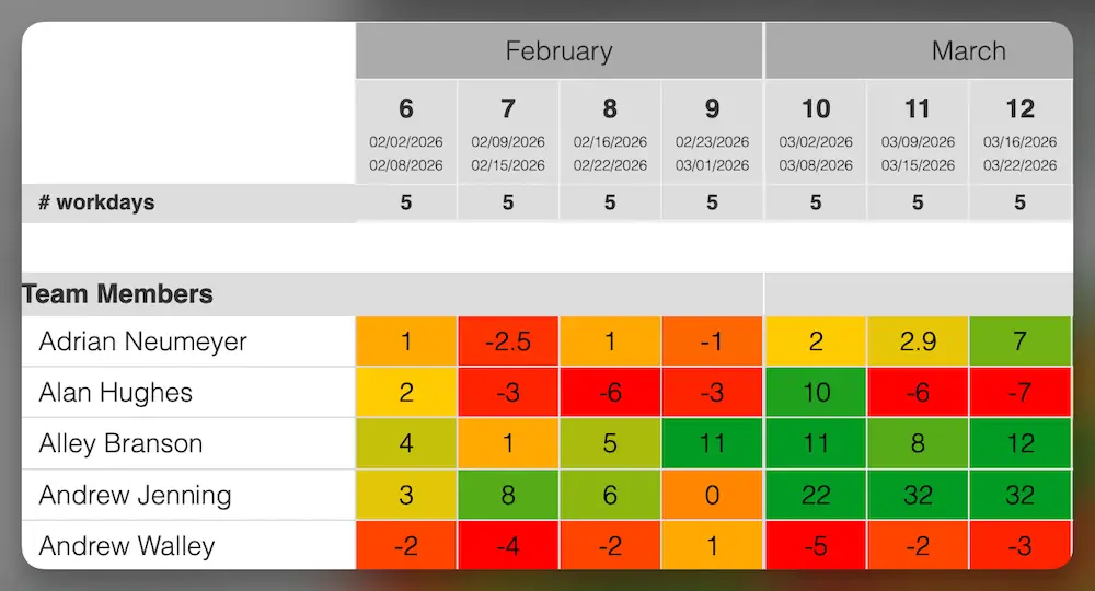
If someone is over-utilized for several upcoming weeks, you can reassign tasks, shift work to a later week/day, adjust scope or deadlines, or add external support.

If someone is under-utilized, you can bring forward planned work, assign additional project tasks, or support another workstream.

Navigating the heatmap​

The navigation bar at the top helps you move through time and adjust what’s shown.

  • Visible months: Choose how many months to display at once. Adjust this depending on your screen size — if the first column disappears, reduce your browser zoom.
  • Date selector: Jump directly to a specific month and year using the dropdowns. The + / − buttons move one month forward or backward.

Making everything fit on screen

Depending on how many months you display, the first column (team member names) may shift out of view on smaller screens.

If that happens, reduce your browser zoom level until the first column becomes visible again. You can also decrease the number of months shown to create more space for names and details.

The zoom function is available in your browser’s menu (usually under View → Zoom) or can be adjusted using keyboard shortcuts like Ctrl + / − (Windows) or ⌘ + / − (Mac).

FAQ

What do the cell values represent?

The numbers shown in the heatmap cells represent the available or remaining hours by person for a particular week (or day). Caperity determines available capacity by taking people’s working hours and subtracting all scheduled work.

Why do management or non-project staff appear on the heatmap?

The heatmap shows everyone who is marked as Plannable. If leadership or other non-project staff appear there, they have the Plannable flag enabled in their person record. To remove them from the heatmap (and other planning views), open the person’s details and turn off Plannable.

The plannable flag controls which team members appear in the planning views.

I’m not seeing any people in the heatmap

That’s because the Heatmap only shows data once people are added, assigned to projects, and have planned hours in the system.

Table of Contents