The Project Allocation Report in Caperity shows how your team’s capacity is allocated across projects over time. Allocations are expressed as percentages of total capacity.
The report is helpful for managers who want to see:
- How a person’s workload is spread across multiple concurrent projects
- Which projects absorb the biggest share of a team’s capacity
- Where key people are heavily allocated, creating delivery risk if priorities change
The allocation report works great in combination with the Team Utilization Report, which shows overall utilization per person.
Report structure
The report is grouped by project. Under each project, you see the assigned team members and their allocation per week or month as a percentage of capacity.
The report is available in both a weekly and a monthly view.
Weekly View
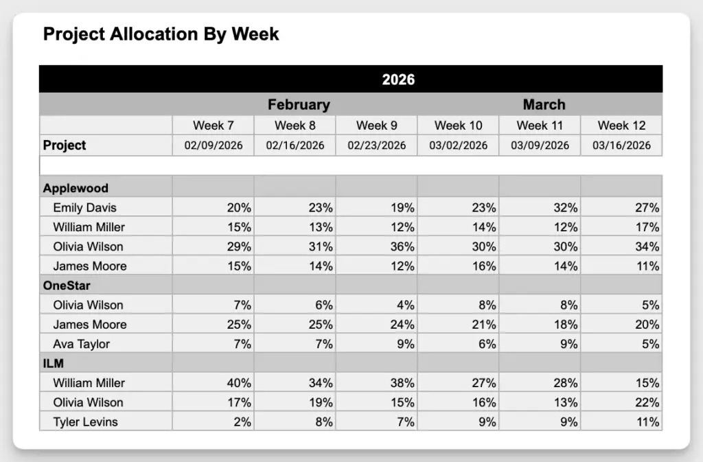
Monthly View

How allocations are calculated
- The planned hours on a project are compared to the person’s total available capacity for that same period. The result is shown as a percentage: planned project hours divided by total capacity.
- If a person is unavailable during a period (for example due to time off), their reduced capacity is taken into account. This ensures the percentages always reflect the person’s real available capacity for that timeframe.
Example:
Brad Smith is scheduled for 4 hours on the Bearcreek Estates project in week 4:
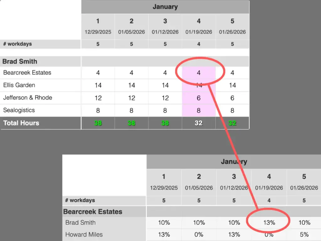
His normal working time is 40 hours per week, but because of a holiday, his available capacity that week is reduced to 32 hours. The allocation rate is therefore calculated as 4 divided by 32 hours, which equals 13%.
If there had been no holiday and his full 40 hours were available, the allocation rate would have been 10%.
Interpreting the percentages
- Start with the big numbers: Look for allocations above ~50% on a single project. That usually means the person is a key dependency, and any staffing or planning change on that project (adding scope, removing the person or pulling them onto another project) will have a direct impact on delivery.
- Watch for “lots of small slices”: If someone shows up with 5–20% on many projects in the same week/month, they may be spread too thin. Even if their overall utilization looks fine, progress often slows because they lose focus and spend more time on coordination and handovers.
- Look for stability vs. noise: Smooth allocations over several weeks/months usually indicate a stable plan, which is good. Frequent jumps (e.g., 10% → 60% → 15%) can be a sign of unplanned scope changes, urgent requests taking capacity away or work not being owned consistently.
- Compare people within the same project: If one person is consistently much higher than everyone else, that can signal a bottleneck or single point of failure. It may mean only one person has the knowledge/permissions, or the work isn’t distributed, so their absence or reassignment becomes a risk.
Useful questions
- Are our priority projects receiving the largest share of capacity?
- Are critical people overly concentrated on one project?
- Are we spreading people across too many initiatives?
- Are there sudden allocation jumps that need explanation?