If you’re overseeing a larger project portfolio, you’ve likely run into the same problem:
You don’t have a clear view of who is working on what and how much time is spent on each project.
There are different ways to visualize resource allocation. Each shows a different perspective but leaves important questions unanswered.
In the following sections, we look at the most common ways to visualize project resource allocation and how to combine them to get a complete picture.
What is Project Resource Allocation?
Project resource allocation describes how people’s time is assigned across projects.
In simple terms, it answers one question: How much of each person’s capacity is allocated to which project, and when?
In practice, allocation is either expressed as a percentage or number of hours per person, per project, over time (for example by week or month).
For example:
Anna → 50% Project A, 30% Project B
Ben → 100% Project C
This makes it clear how work is distributed across projects.
A complete allocation view always includes three elements: the project, the person (or team) and the time period.
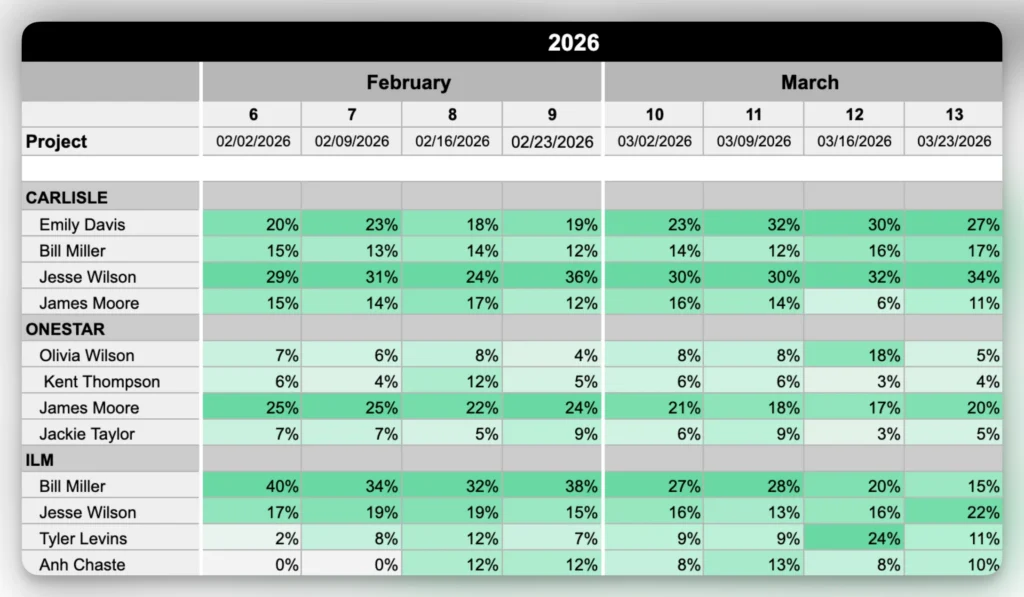
Project-First Allocation View
This is one of the most helpful ways to understand how a project is staffed and how allocation evolves over time.
This view starts with the project and shows the assigned team members underneath. For each person, you see how much of their time is allocated across weeks or months, usually as percentages.
Key features
Project as the primary structure
Team members listed under each project
Allocation shown as % or hours
Time axis (weeks or months)
Often includes color coding for load
Why it’s useful
Shows how much capacity is assigned: All team members and their allocation are in one place, making it easy to judge if the planned effort is enough.
Makes staffing over time visible: You can see how allocation changes across weeks or months, including ramp-ups, drop-offs or gaps.
Highlights gaps and risks early: Missing roles, low allocations or uneven distribution stand out without needing to dig through different views.
Cons
Does not show total workload per person across projects
Hard to spot overload if people are on many projects
Requires switching views to balance workload across the team
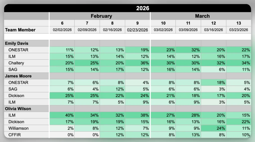
Person-First Workload View
Here we are flipping the perspective. You start with a person and see all the projects they are working on, including how much time they spend on each. It typically looks like a table where each person has their own section, with projects listed underneath and allocation over time.
By summing allocations across projects, this view effectively shows utilization and highlights when someone is over or under capacity.
Key features
Person as the primary structure
Projects listed per person
Allocation shown as % or hours
Time axis (weeks or months)
Why it’s useful
Shows how a person’s time is split across projects: All allocations are in one place so it’s clear how work is distributed.
Highlights overload and unused capacity: It becomes obvious when total allocation is too high or too low.
Makes it easier to rebalance work: You can quickly see where to shift hours between projects.
Cons
Less clear how a project is staffed overall
Doesn’t show team composition per project
Requires switching views to understand project-level impact
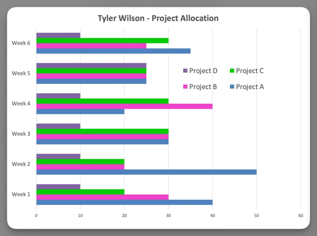
Stacked Allocation Chart
This view shows allocation as stacked bars, usually per person or team. Each bar represents a time period (e.g. a week), and segments within the bar represent different projects. The total height of the bar shows total allocation.
Key features
Bar chart with stacked segments per project
Time on the x-axis
Allocation shown as proportions
Why it’s useful
Shows how work is split across projects: Each segment represents a project so the distribution is easy to understand.
Makes changes in allocation visible: Shifts between projects over time are easy to spot.
Helpful for summaries: Gives a quick overview that is easy to present and explain.
Cons
Hard to read at individual level
Not practical for large teams
Does not show exact values (hours etc.) clearly
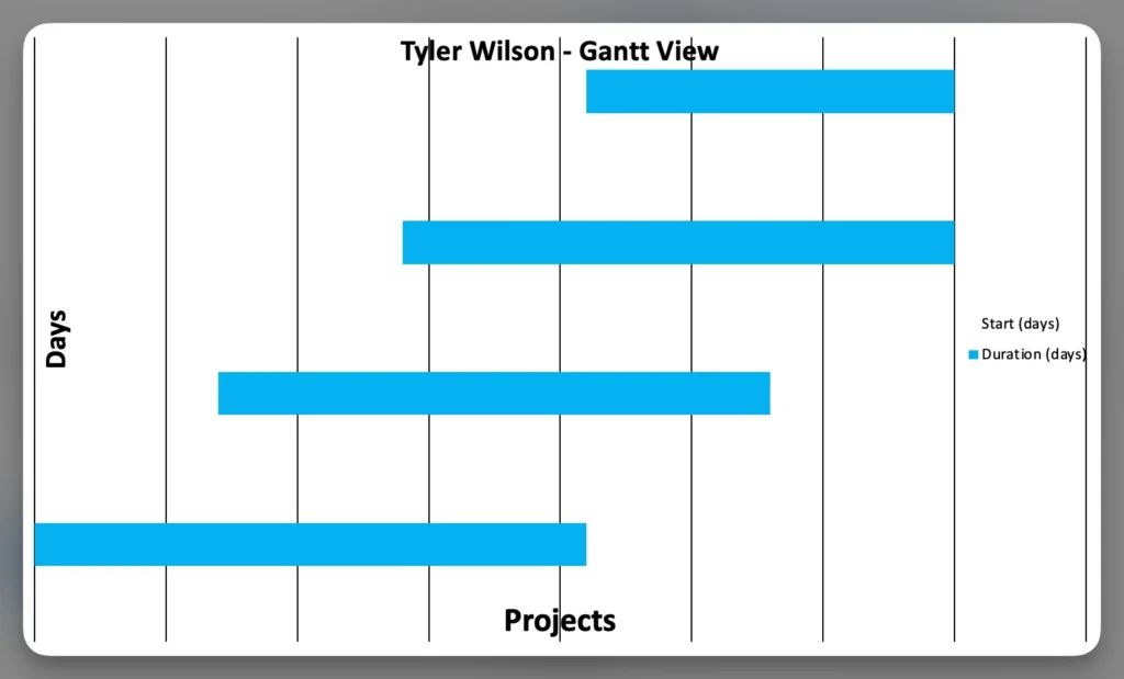
Gantt-Style Allocation View
In this view, work is shown as bars along a timeline. Each bar represents a task or project phase, with people assigned to it. It looks like a traditional Gantt chart, where time flows from left to right and work is visualized as blocks.
This is commonly used in project planning tools.
Key features
Timeline with tasks or phases
Assigned people per task
Visual duration of work
Why it’s useful
Shows when people are allocated to a project: You can see when someone is scheduled to work on a project or task.
Helps understand how allocation is spread over time: Overlaps and gaps between assignments become visible.
Makes timing conflicts easier to spot: You can see when the same person is assigned to multiple things at the same time.
Cons
Does not show actual workload per person
Hard to see workload across projects
Requires manual interpretation to assess capacity
Summary
Project resource allocation can be viewed from different angles. You can look at it from the project side to understand how much capacity is assigned, from the person side to see how work is distributed, and over time to understand when that work happens.
Each view highlights a different part of the picture, and no single view is enough on its own. To understand allocation fully, you need to combine these views — to see whether projects are properly staffed, whether people are overloaded, and whether the timing actually makes sense.
Adrian Neumeyer has spent over a decade in project delivery, leading high-stakes strategic IT initiatives for major global engineering firms like Bosch and HILTI. He is also the Founder of Caperity, focused on giving managers a simple, practical solution for project capacity planning.